

The problem with sRGB gradients
Open any CSS gradient in a browser and watch it turn muddy in the middle. A gradient from orange to teal almost always produces a grey-brown band halfway through. It is not a bug — it is the math.
Standard linear-gradient() interpolates in sRGB: it averages the red, green, and blue channels independently. The problem is that sRGB is not perceptually uniform. Equal numeric steps do not look like equal color steps to the human eye. When you mix a vivid orange (high red, medium green, zero blue) with a vivid teal (zero red, high green, high blue), the midpoint sits at values that translate to a low-saturation grey.
/* sRGB — the grey-band problem */
background: linear-gradient(to right, #E8921A, #3ABDB0);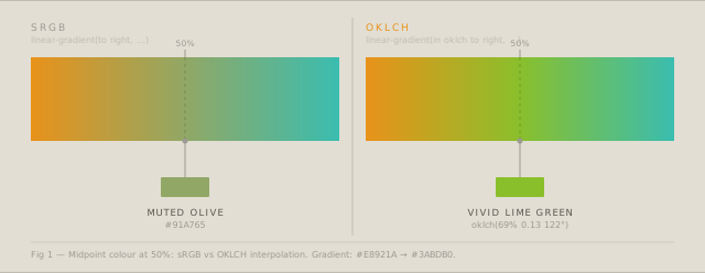
What OKLCH actually is
OKLCH is a polar coordinate representation of the Oklab color space, designed by Björn Ottosson and adopted by CSS Color Level 4. It describes every color with three values:
- L — perceived lightness (0 = black, 1 = white)
- C — chroma (saturation, roughly; 0 = grey)
- H — hue angle (0–360°)
The “OK” prefix means the space is perceptually uniform: a step of 0.1 in lightness looks the same size visually regardless of where you are in the color space. This is the key property that sRGB lacks.
/* OKLCH equivalent values */
oklch(63% 0.17 53)   /* amber  — our #E8921A */
oklch(75% 0.10 190)  /* teal   — our #3ABDB0 */
How interpolation changes the gradient
When CSS interpolates between two OKLCH colors, it travels through the color space along the shortest path for each of L, C, and H. Because the space is uniform, the midpoint is guaranteed to be visually halfway — not numerically halfway in sRGB.
/* CSS Color 4 — OKLCH interpolation */
background: linear-gradient(
  in oklch to right,
  oklch(63% 0.17 53),
  oklch(75% 0.10 190)
);
The midpoint now sits at approximately oklch(69% 0.13 122) — a warm yellow-green — which is both more saturated and more visually balanced than the sRGB midpoint.
A gradient that stays vivid through the middle reads as intentional and high quality. The grey-band artefact reads as amateur, even if viewers cannot name why.
The hue-path problem
OKLCH introduces one new consideration: hue wraps around 360°. Two hues can be connected by two different arcs — a short arc and a long arc. CSS defaults to the shorter arc, but sometimes the longer arc produces a more interesting transition.
A gradient from blue (H≈250°) to red (H≈30°) by the short arc goes through purple. By the long arc it goes through green and yellow.
/* Short arc — through purple */
background: linear-gradient(in oklch to right, oklch(50% 0.2 250), oklch(55% 0.2 30));

/* Long arc — through yellow (add "longer" keyword) */
background: linear-gradient(in oklch longer hue to right, oklch(50% 0.2 250), oklch(55% 0.2 30));
The CSS Gradient Generator on uicorn lets you toggle between short and long hue paths and previews both in real time.
Browser support
OKLCH in CSS is supported in all modern browsers since 2023. For older browsers, provide an sRGB fallback:
/* Progressive enhancement */
.hero {
  /* Fallback for older browsers */
  background: linear-gradient(to right, #E8921A, #3ABDB0);

  /* OKLCH for all modern browsers */
  background: linear-gradient(in oklch to right, oklch(63% 0.17 53), oklch(75% 0.10 190));
}
The fallback is ignored by browsers that understand in oklch. Browsers that do not understand it fall back silently to the sRGB version.
Using the uicorn gradient generator
The CSS Gradient Generator handles OKLCH conversion automatically. You pick colors using the standard hex/HEX picker, and the tool converts them to OKLCH before generating the gradient code.
Key features worth using:
- Interpolation toggle — switch between sRGB and OKLCH and compare the midpoint
- Animated output —
background-size: 400% 400%with keyframe animation for shifting gradients - Hue path — short arc vs long arc for multi-color gradients
- Multiple stops — add as many color stops as needed; OKLCH interpolation applies between each adjacent pair
The output CSS is production-ready: it includes the in oklch syntax, optional animation keyframes, and the sRGB fallback line.
When to use sRGB instead
OKLCH is not always better. For gradients between two close colors — for example, a light-to-slightly-darker version of the same hue — sRGB and OKLCH produce nearly identical results. The benefit of OKLCH is most visible for:
- Gradients crossing complementary or triadic hues
- Gradients that need to stay saturated throughout
- Animated gradients where the midpoint is visible for a long time
- Design-system color scales where perceived uniformity matters
For subtle texture gradients or near-white backgrounds, sRGB is fine and avoids the extra CSS.
Try the CSS Gradient Generator to see OKLCH vs sRGB interpolation side by side with your own colors.